01 — Project Details
BCBS Louisiana 2024
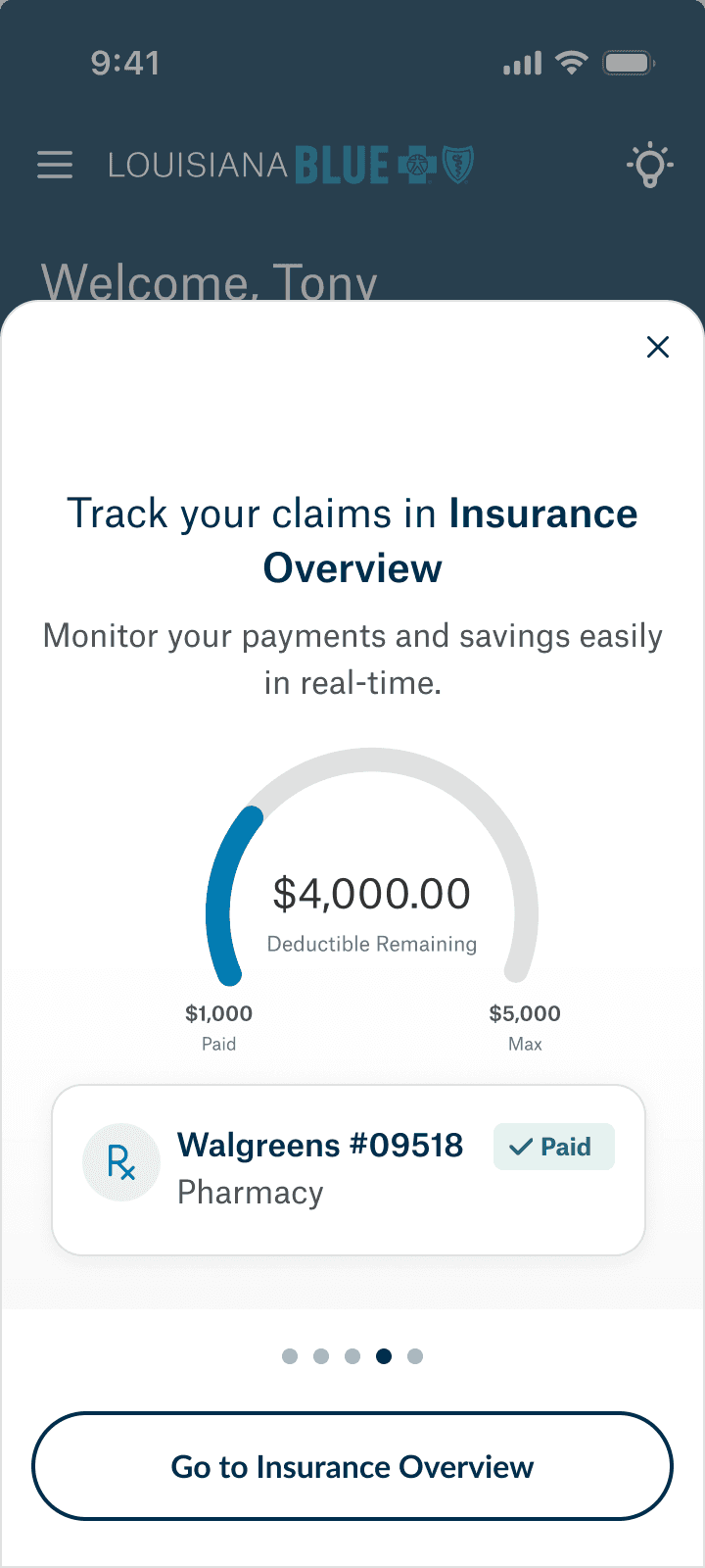
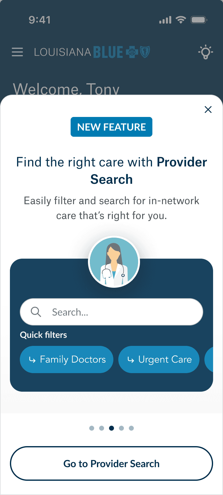
BCBS of Louisiana wanted a new app for users to easily manage coverage, track claims, access digital ID cards, connect health records, and receive personalized health tips—all in one place.
Our team was tasked with designing the app end-to-end, including an onboarding flow to help acclimate users to the new features.
02 — Team Dynamics
My Role: UX Writer, Assistant UX Researcher
Tools: Figma & Plugins, Maze
Members: UX Designers, Lead UX Researcher, Product Manager, Developers
03 — The Problems
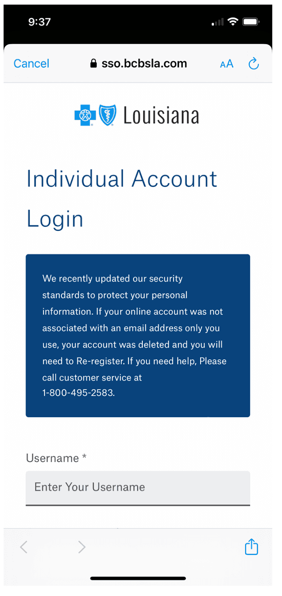
The previous app had no onboarding experience, leaving users without guidance on how to get started.
Many users associated the app solely with managing insurance benefits
Users may not be eager to access and manage a broader range of healthcare services like accessing health records, scheduling care, and gaining personalized insights.
We theorized that this lack of orientation would lead to user confusion and underutilization of key features.
04 — Design Process
Ideation
The team and I had a very quick deadline so we spent two days doing competitive analysis of onboarding flows for major apps and the features included in the top insurance apps, empathy mapping, building users journeys, and deciding on project goals and OKRs.
Research
We implemented a few Maze surveys to get insight into what users want from their insurance apps and what about onboarding flows tend to overwhelm them and reduce completion. We also took feedback from surveys completed after we finished an onboarding flow for a previous Walgreens app.
Design
We had a week to do both design exploration and incorporate our research findings into hi-fi designs to be showcased to major shareholders. Our design efforts were led by me, since onboarding relied heavily on content architecture. We did several workshops with major stakeholders to get aligned, and then completed several all day design sessions consisting of myself and the designers.
Validation
We did post QA user testing and additional surveys prior to creating a slide deck and design prototype showcasing the design + the testing results to the BCBS LA client. We then refined based on client feedback + other variables that came into play while designing the new app features to ensure everything felt like a holistic experience for the user and hit client OKRS and other success metrics.
04 - Final Content Decisions Showcased in the Designs Below
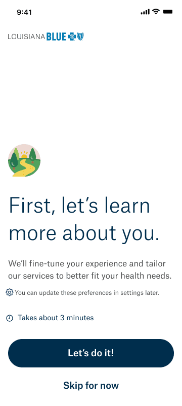
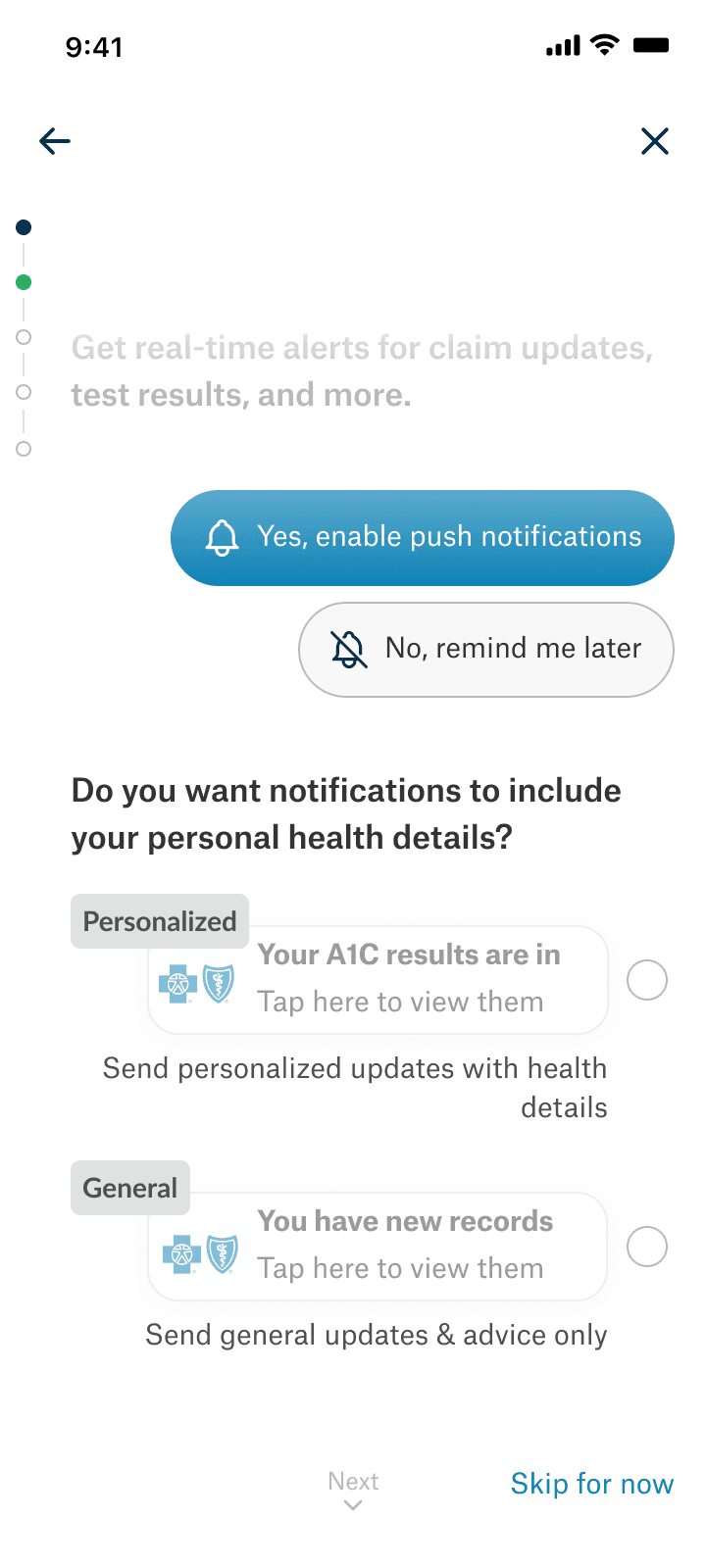
Include duration transparency in onboarding for improved completion rates
Knowing the duration and steps involved can motivate users to complete a flow, as they can plan and allocate their time accordingly.
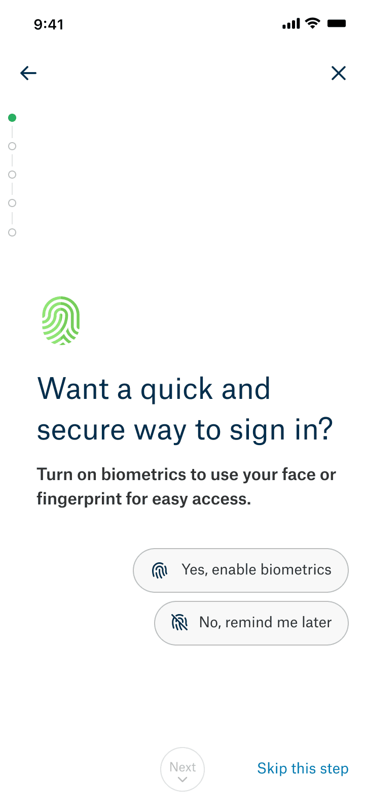
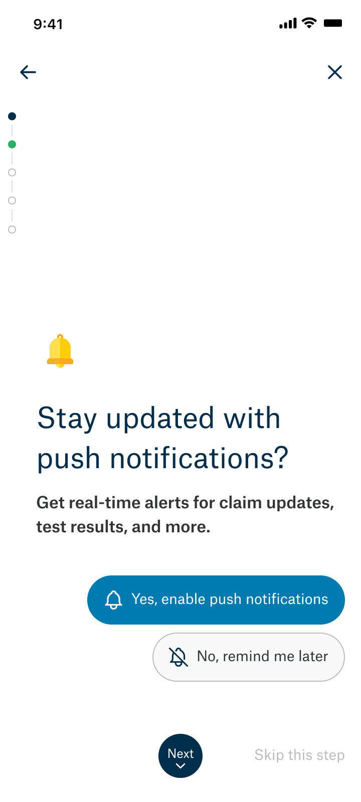
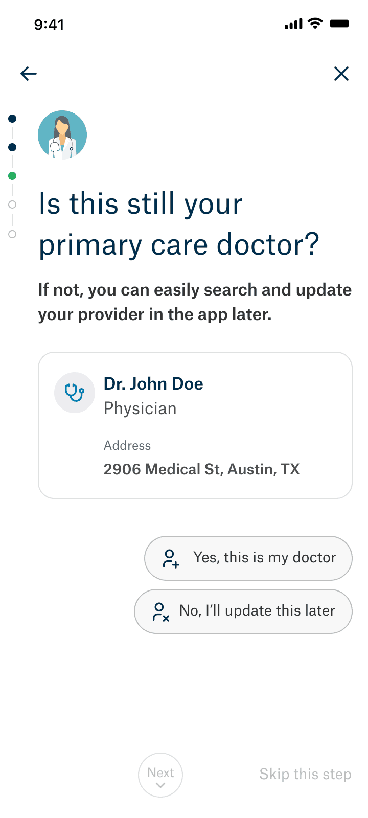
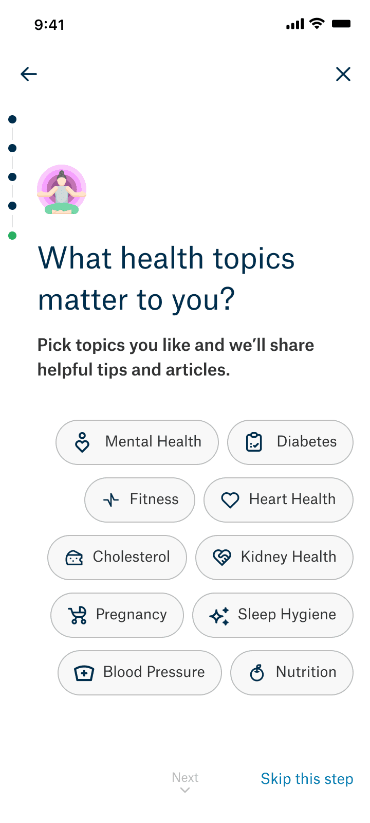
Have easily digestible formatting for streamlined interaction
This presents information in a digestible, step-by-step format, which helps users focus on one task at a time and reduces cognitive overload.
Have bottom-right-justified CTAs for enhanced usability
These are optimized for touch interactions, making it easier for users to navigate and engage with content on mobile devices.
Create chat-bot design for increased engagement
A chatbot-like design mimics natural conversation, which can make the onboarding experience feel more interactive and personalized.
04 - The Results
95%
of tested users expressed their satisfaction with onboarding and excitement to try new features
853
headaches occurred while reading the extremely long confluence pages our client success members and project managers painfully created.
17,432
Slack messages sent, mostly containing gifs and desperate cries for help throughout the project.