Here's a few case studies that highlight real projects & real impact:

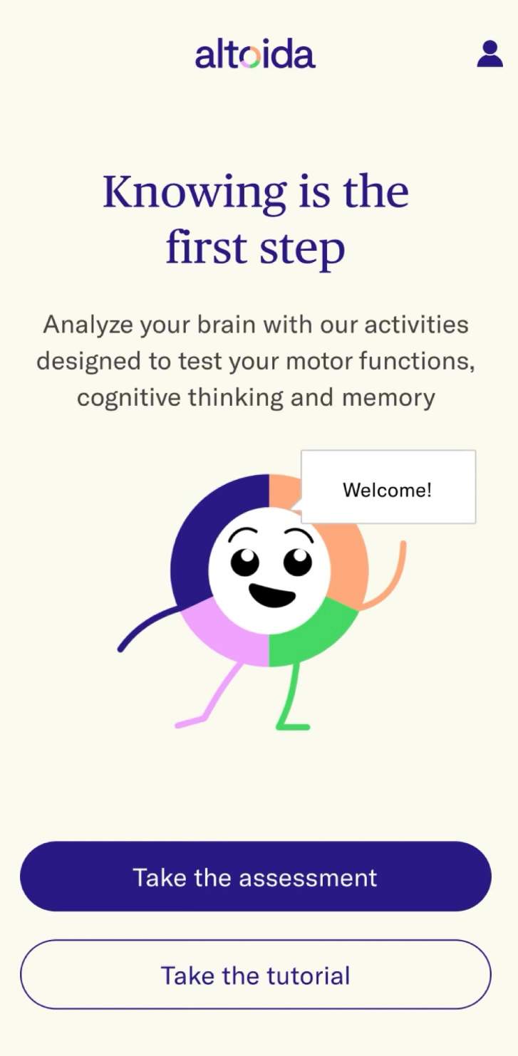
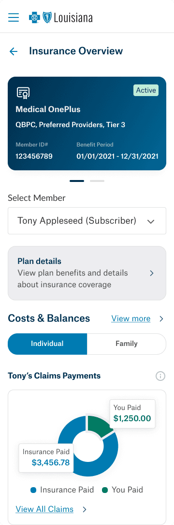
& here’s a few extra samples of my work:
Hear from people who've worked with me:
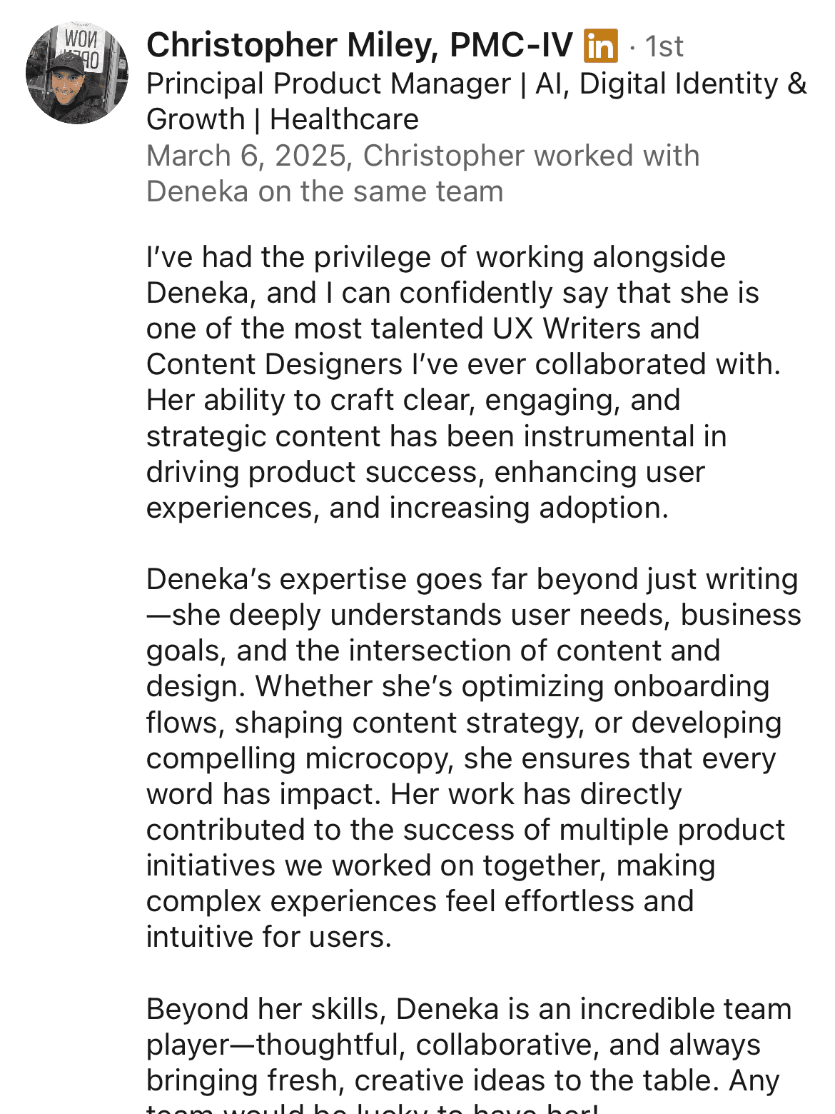
No coworkers were harmed or threatened for the creation of this post.
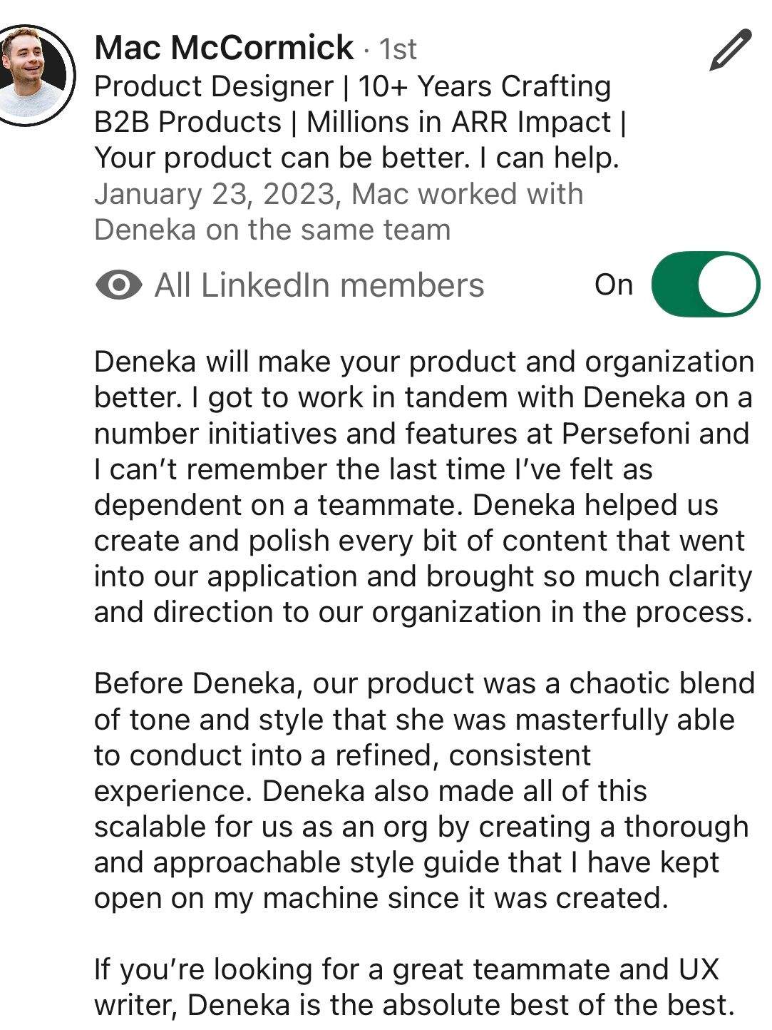
No AI was used in the creation of this particular post so all praises are genuine.