01 — Project Details
b.well Connected Health 2023
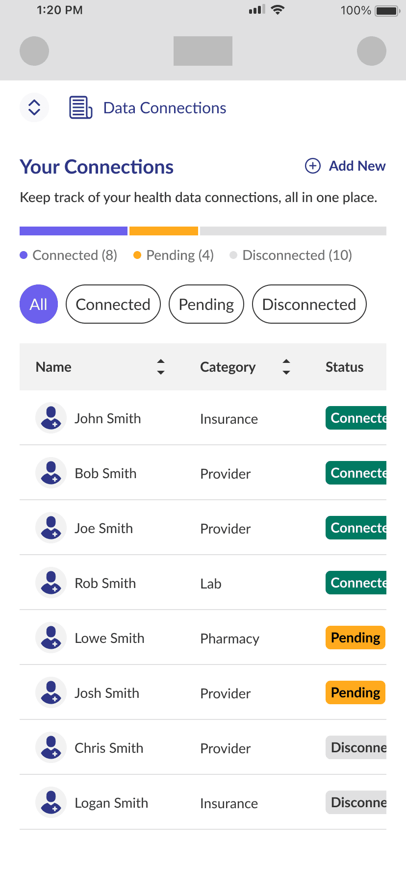
b.Well connected health focuses on expanding healthcare interoperability and improve health management. Their Data Connections feature aims to let users easily sync all their health records in one place to create a longitudinal health record.
Our team was tasked with redesigning the Data Connections feature to improve lackluster user engagement.
02 — Team Dynamics
Role: UX Writer
Tools: Figma & Plugins
Members: UX Designers, UX Researcher, Product Manager, Developers
03 — The Starting Point
The Data Connections feature struggled with poor engagement as a new market feature.
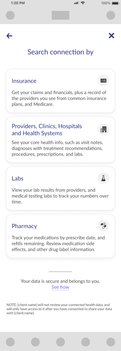
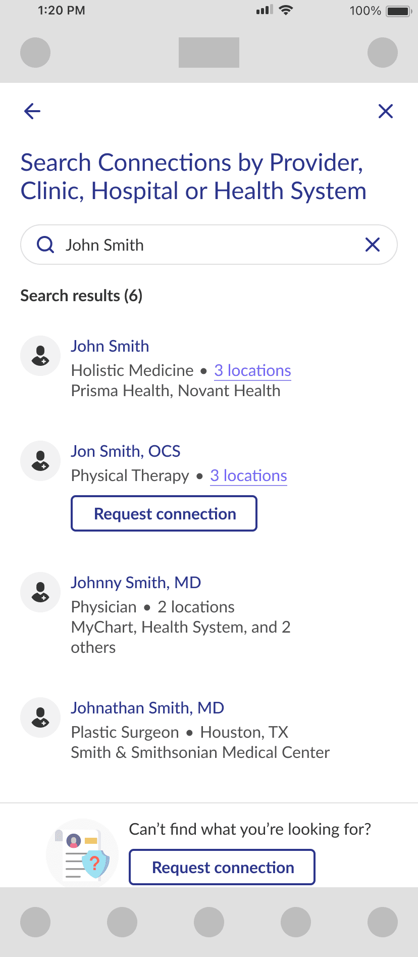
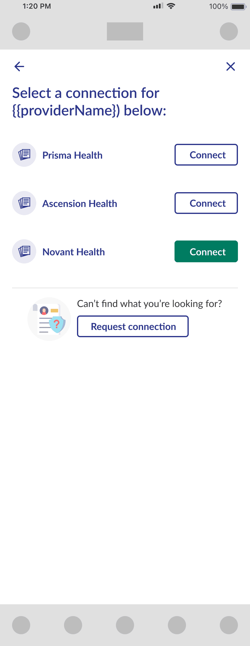
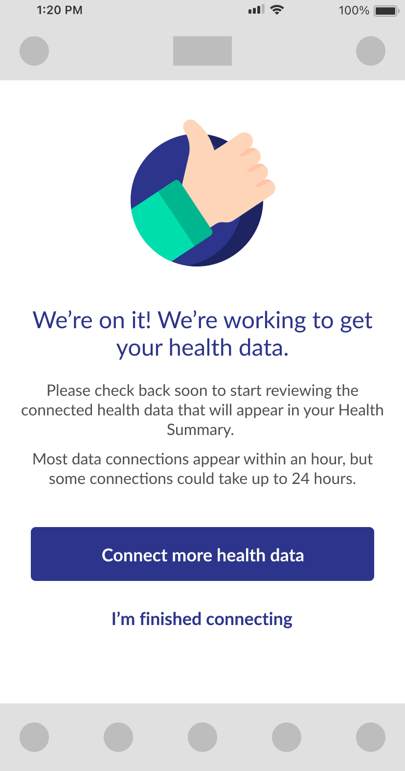
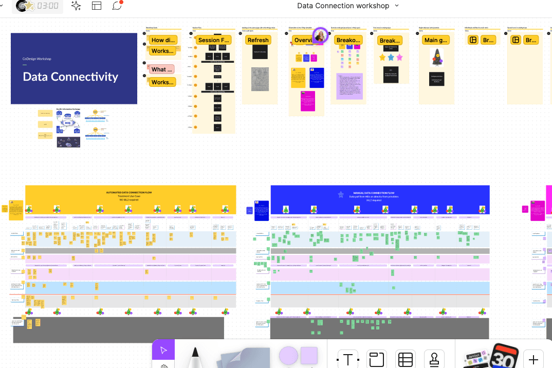
The concept of connecting to various health portals to pull records into a centralized location was a very new market concept. The previous design was done in 2020 and was very rushed, so many users struggled with the confusing user flow and poor experience.
To address this, our team undertook a comprehensive redesign to improve usability, engagement, and overall satisfaction.
The Previous Designs
05 — Content Design Strategy
I strategized how to overhaul the previous user interface to make it more interactive and user-friendly. I achieved this with:
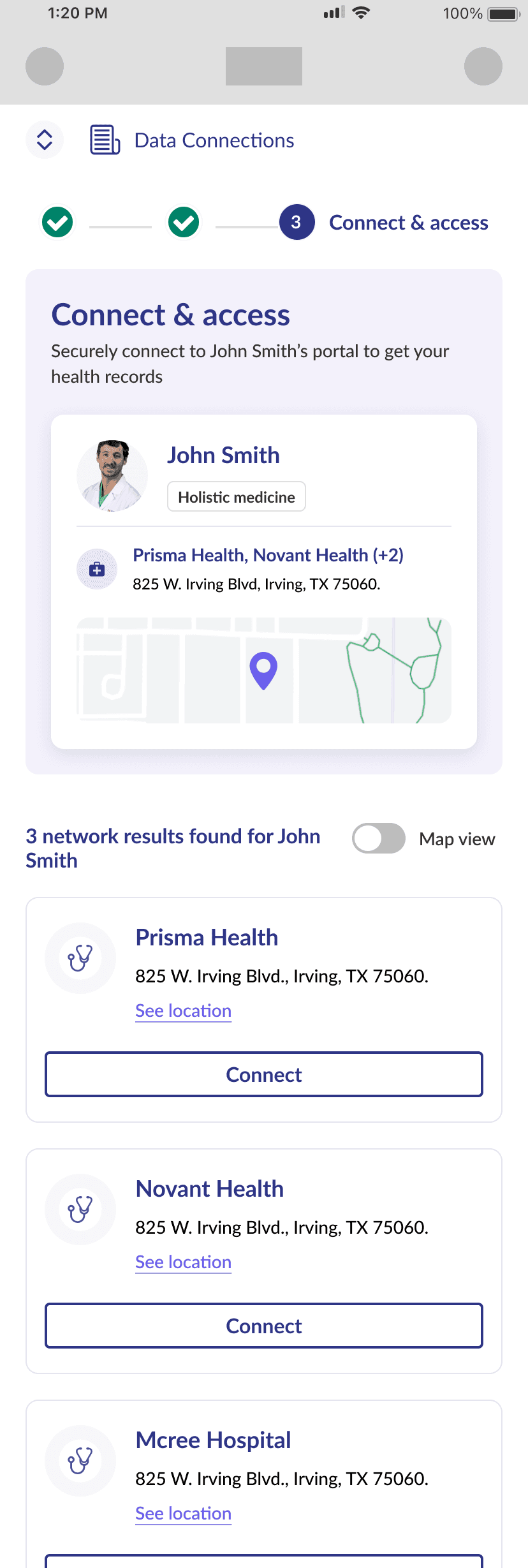
Interactive Design: I proposed introducing dynamic elements to create a more engaging, guided experience that reduces cognitive load and improves user interaction. This included a progress bar with success messaging/animations and rewards for achieving milestones in the flow.
Simplified Content: I simplified content and terminology, added tooltips, and structured guidance to make steps clear and easy to follow, reducing user anxiety.
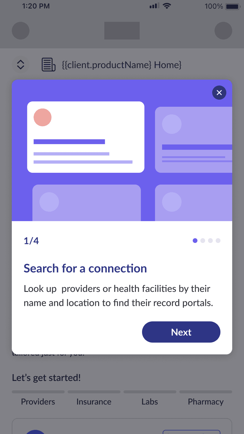
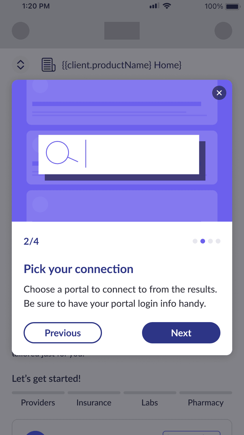
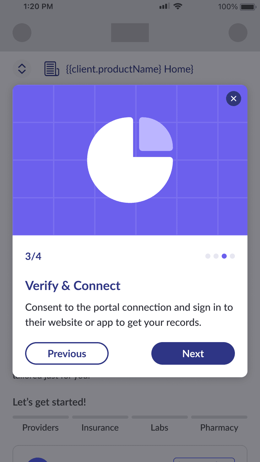
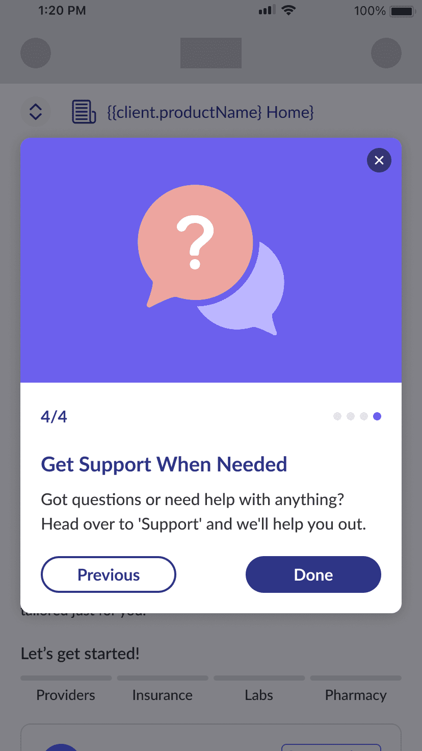
Onboarding Guidance: I proposed implementing feature onboarding that provided clear, step-by-step instructions for the entire flow.
06 — New Design Iterations
07 — The Results
40/40
tested users reported a significant drop in cognitive load, finding it easier to connect to providers with minimal confusion compared to the original flow.
37/40
tested users stated new interactive design and simplified content turned the process into more of an experience rather than a daunting task and preferred the added gamification elements.
+ 3
major clients agreeing to incorporating SDKs in their healthcare products including Samsung, Amazon, etc.
