Impact Spotlight: Making Provider Search Easier for Patients
I know you're busy, so here's a brief example of the measurable impact I bring to the content design table.
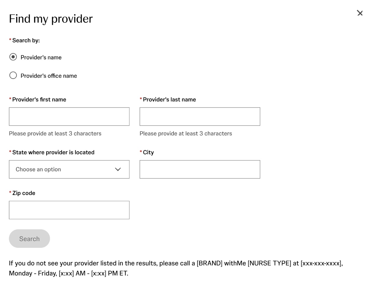
The problem: Patients were dropping off during provider search while enrolling in a medication savings program. A misspelled city, abbreviations, or a doctor’s name that differed from the system’s records would not return any results. Unclear labels also left patients unsure whether to enter their doctor’s name or the office’s name.
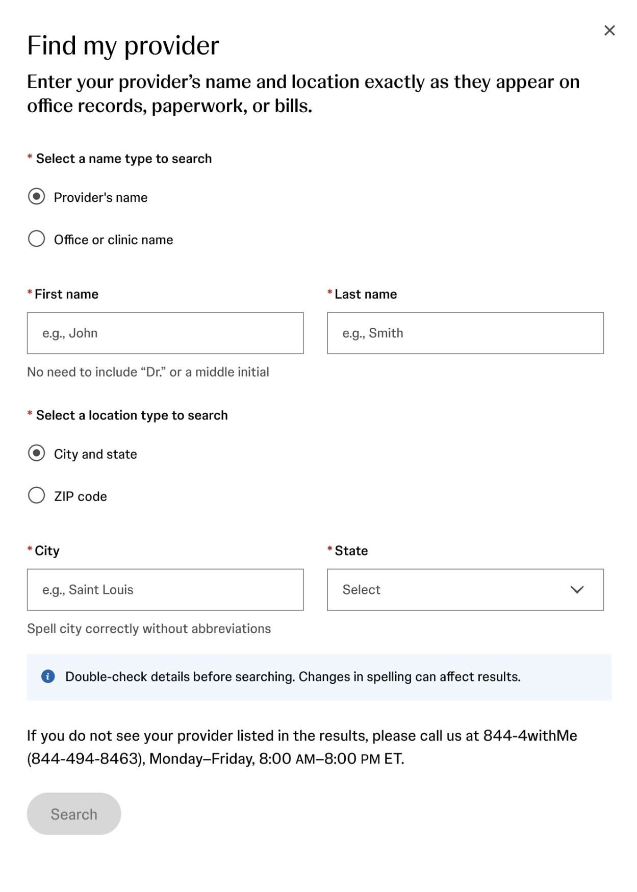
The fix: I led the content and UX redesign due to team constraints. I restructured search options and added clearer labels, examples, and timely guidance to help patients find their providers within the system’s technical limits.
The impact: Analytics now show high completion rates and substantially less time spent on the modal, resolving a major point of friction.
(Click arrows to see before & after images)